This guide explains how to use the Sales Reporting section of TickX IQ to track and analyse sales performance across revenue, orders, tickets, group sizes, and trends over time. It covers how to read the main revenue chart, use forecasting, apply annotations, and switch between gross and net revenue using the Net Sales toggle. It also outlines how to apply advanced filters, compare date periods, review ticket-type performance, analyse sales by hour with heat maps, and evaluate upgrades and add-ons. This helps you understand sales patterns, optimise marketing strategies, and make data-driven decisions directly within the TickX IQ dashboard.
How IQ Sales Reporting Works
Sales Reporting is the main area within your TickX IQ environment for tracking and analysing your sales data. It offers a range of features, from top-level revenue summaries to detailed breakdowns by ticket type, group size, and sales trends, enabling you to understand and maximise your sales potential.
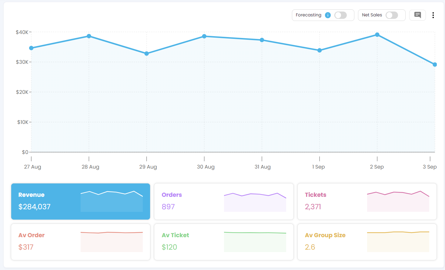
Main Revenue View
- At the top of the sales reporting page, you will see the main line chart that provides an overview of your sales performance in local currency & timezone. This chart displays:
- Total Revenue
- Total Number of Orders and
- Total Number of Tickets sold.
- Average Order Value – the average revenue per order.
- Average Ticket Value – the average revenue per ticket.
- Average Group Size – the average number of tickets per order.
- How to Use:
Click on any of these key performance indicators (KPIs) to update the main sales line chart, which will then display the selected metric trended by date.
Annotations
-
The Annotations feature allows you to add notes or highlights to any chart, helping to mark significant trends or insights.
-
Please see how to enable & make the best use of annotations here
Net Sales
- You can easily toggle on a Net Sales view which will let you see your realtime revenue less fees and taxes.
- To use the Net Sales feature, we must first configure the revenue; this can be done by going into Settings > Account Settings > Revenue Calculator.
- When the Net Sales is switched on, the figures should all change as the sales are now deducted with several fees.
Date Selector and Comparison Tool

- You can adjust the dates displayed on the line chart using the date selector at the top right-hand side of the page.
- Fixed Date Selections: Choose from several pre-set date ranges relative to the current date.
- Custom Date Ranges: Select "Custom" under the date selector to define specific date ranges.
- Comparison Feature: Enable the comparison feature to compare your sales performance or other KPIs against a previous period.
- How to Use: Select your desired date range or comparison period and click "Apply" to update the dashboard accordingly.
Advanced Filters for Detailed Analysis
- The full sales dashboard can be filtered using advanced filter sets, including options for marketing channels, purchase flow, and detailed event information.
- How to Use: Apply these filters to refine your sales data and focus on specific areas of interest. For more information, please see the full guide on advanced filters attached here.
Ticket & Group Size Breakdown
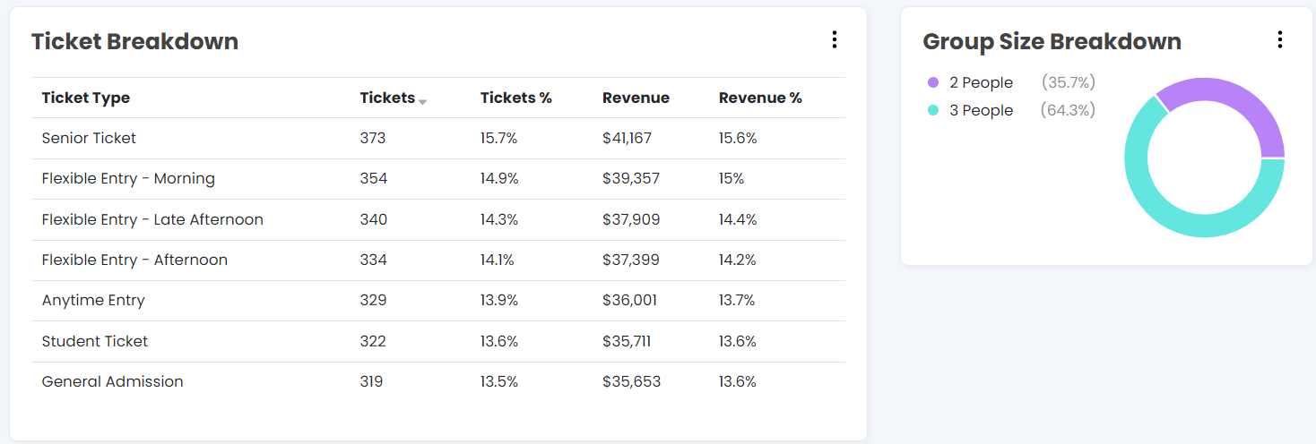
- Below the main sales chart, you can view a breakdown of your tickets and revenue by specific ticket type.
- This section helps you understand which ticket types are selling the most and how they contribute to your total revenue.
- You will also see a pie chart illustrating the group size breakdown, showing the average number of tickets sold per order.
- How to Use:
Use these charts to analyse the popularity of different ticket types and group sizes, helping you tailor your marketing strategies to meet customer demand.
Sales by Order and Heat Map Analysis


- The "Sales by Hour" section shows the total revenue generated by transactional hour, allowing you to observe sales trends throughout the day.
- Use the toggle at the top right-hand side of this chart to switch to a heat map view.
- The heat map displays sales activity by day of the week and hour of the day, providing insights into when your customers are most active.
- How to Use:
Utilise this data to adjust your marketing efforts, focusing on periods with high customer activity or identifying opportunities to increase engagement during quieter sales periods.
Upgrades and add-on reporting
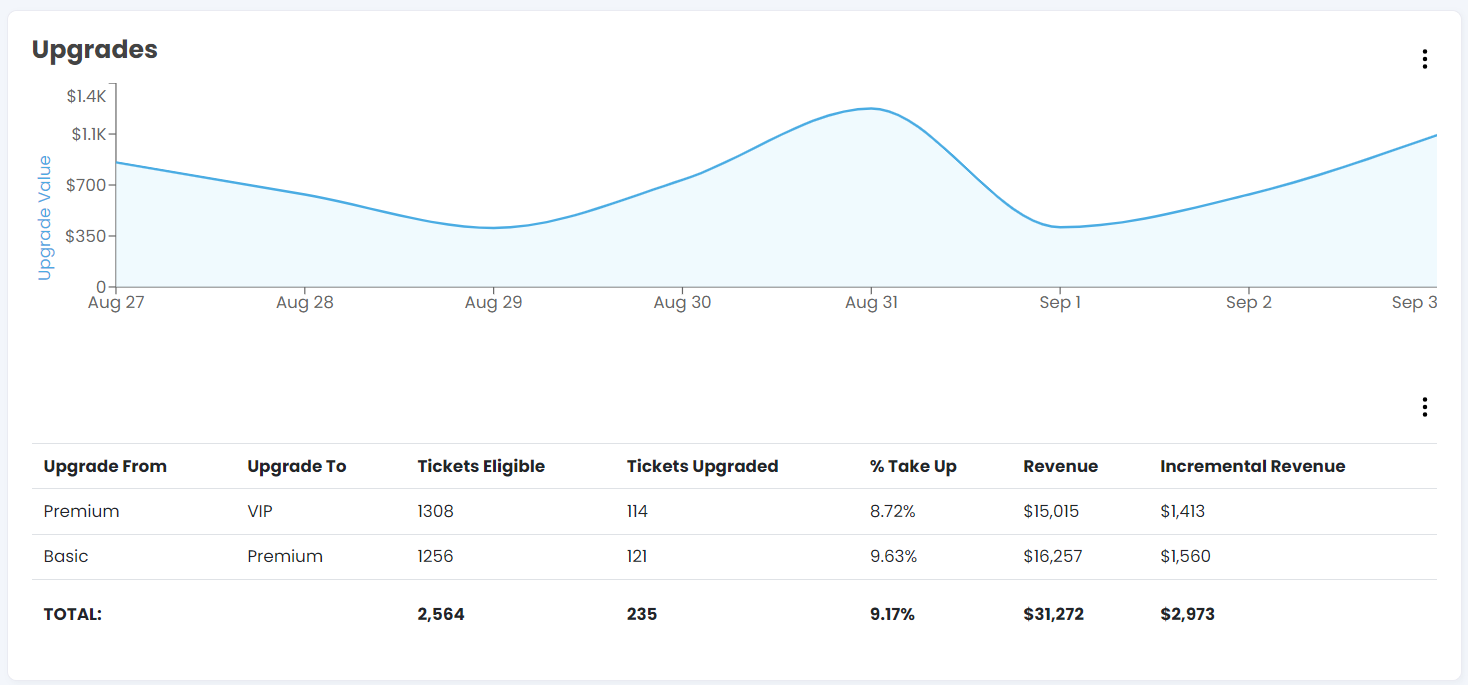
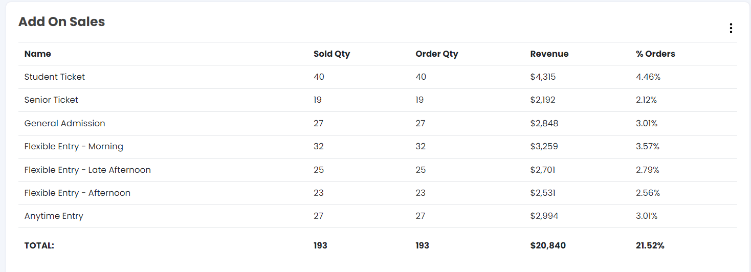
These graphs show the sales data of non-tickets products, such as merchandise, upgrades, restaurant add-ons, etc. The tables give data of the quantity sold, GTV and % out of the total orders.
For other dashboard areas see the below pages:
- Sales Reporting - Performance / Attendance
- Sales Reporting - Location
- Sales Reporting - Flows
- Sales Reporting - Marketing
Demos, feedback and training
If you or any members of your team would like some training on how to get the best data out of the TickXIQ platform please reach out to your account manager. Likewise if you have any feedback or you would like to see a particular report, please let your account manager though as we love to evolve our product around our clients needs.